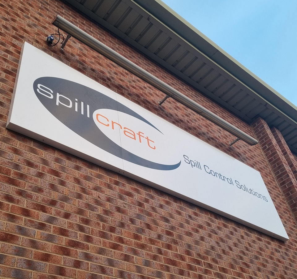
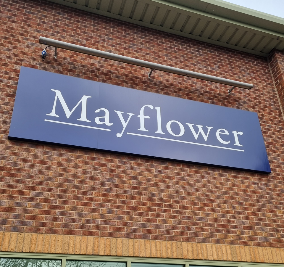
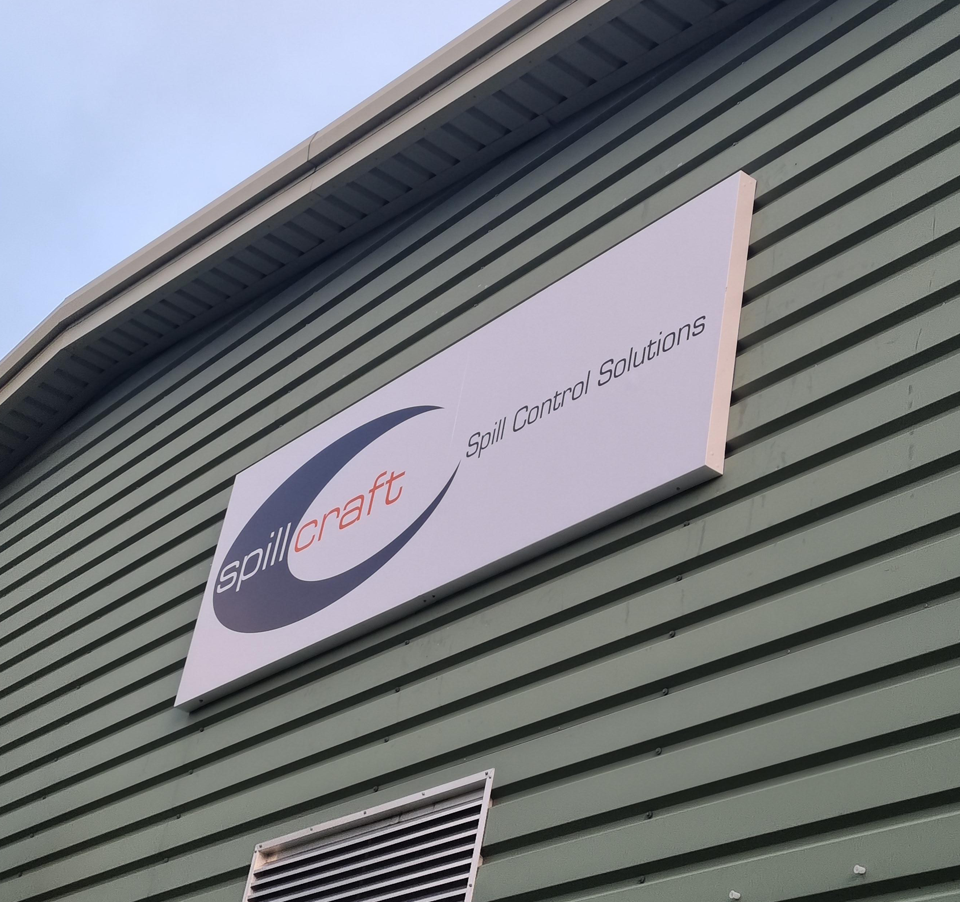
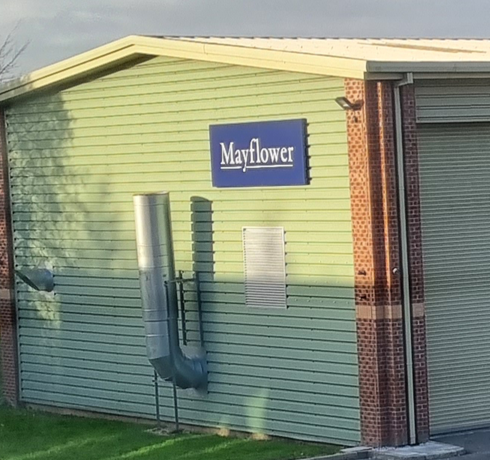
Shadowfoam

2019-11-01T10:49:43+00:00

Keeping with the Shadowfoam branding and design I utilised their existing assets and created a Twist exhibition stand which was supplied by my exhibition partner.

This Twist package consists of x4 800mm Twist stands, x1 550mm flexi panel to allow the curve, x2 wheeled cases with graphic panels and black counter tops and x4 LED lights.

If you are interested in Shadowfoam have a look at their website

Shadowfoam2019-11-01T10:49:43+00:00

Loverseed Fitness

2019-06-16T15:52:04+01:00

John came to me for a logo for his new personal fitness business.  Playing on his surname I immediately realised that if I coloured it correctly it would double up as LOVE FITNESS so it made sense to go with that concept.  It’s also not that obvious but the two hearts also symbolise a “J” and an “L” which again is keeping with the theme of fitness and of course John’s surname.  Is it all a bit too clever, I don’t know 🙂

Loverseed Fitness2019-06-16T15:52:04+01:00

Castle Metals

2018-08-02T12:07:51+01:00

Working with Castle Metals on a revamp of their 2016 exhibition stand is this new beauty. I reconfigured the existing artwork that I created two years ago and worked with an outside exhibition company that built the stand. The whole stand is really impressive and houses 2 meeting rooms at the back with glass and metal fixtures, a screen, display cabinets and LED lighting as some of the features of this build.  If you have any project up to this size or greater then please get in touch for more information.

Castle Metals2018-08-02T12:07:51+01:00

Nail Perfection

2018-06-16T18:58:52+01:00

Nail Perfection are simplifying their brand, giving their shop a makeover and updating all of their printing.  Starting off with a new logo design I have supplied this lovely white tray sign.  All finished of with a red face, chrome fret cut logo with matching chrome address and phone number.  The customer has fitted this themselves and done a great job.

Nail Perfection2018-06-16T18:58:52+01:00

StagePro Academy

2018-02-25T20:00:37+00:00

StagePro had an idea for a word cloud on their largest wall in the building.  After spending quite a bit of time moving words around to try and fill gaps, this design was finally good to go.  All lettering was matt vinyl cut and fitted to the wall with an overall size of 4 metres wide and 2.5 metres tall.  I love it and think it creates a nice feature to inspire all students for years to come.

StagePro Academy2018-02-25T20:00:37+00:00
Go to Top