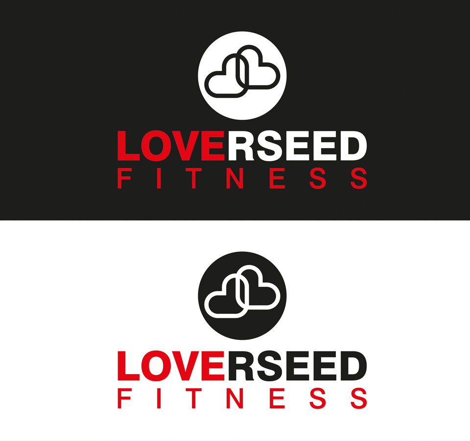
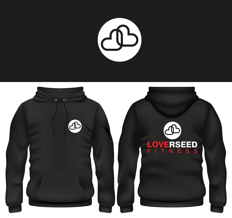
John came to me for a logo for his new personal fitness business. Playing on his surname I immediately realised that if I coloured it correctly it would double up as LOVE FITNESS so it made sense to go with that concept. It’s also not that obvious but the two hearts also symbolise a “J” and an “L” which again is keeping with the theme of fitness and of course John’s surname. Is it all a bit too clever, I don’t know 🙂